Grafana in 2026: The Complete Guide to Modern Data Visualization and Monitoring
Introduction
You have data flowing through your systems. Metrics from applications, logs from services, traces from distributed systems. The data exists, but you need to see it.
Grafana solves this problem. It turns raw data into visual dashboards that help you understand what’s happening in your infrastructure and applications.
Originally built for monitoring time-series metrics, Grafana evolved into a comprehensive observability platform. It connects to dozens of data sources. It powers dashboards for DevOps teams, data engineers, business analysts, and IoT systems.
This guide covers everything you need to know about Grafana. You’ll learn what it does well, where it fits in your stack, and how to use it effectively.
What is Grafana?
Grafana is an open-source visualization and analytics platform. You connect it to your data sources, build dashboards, and set up alerts.
The core value is flexibility. Grafana doesn’t store data. It queries data from wherever it lives. Prometheus, InfluxDB, Elasticsearch, PostgreSQL, CloudWatch, BigQuery. Over 100 data sources work with Grafana.
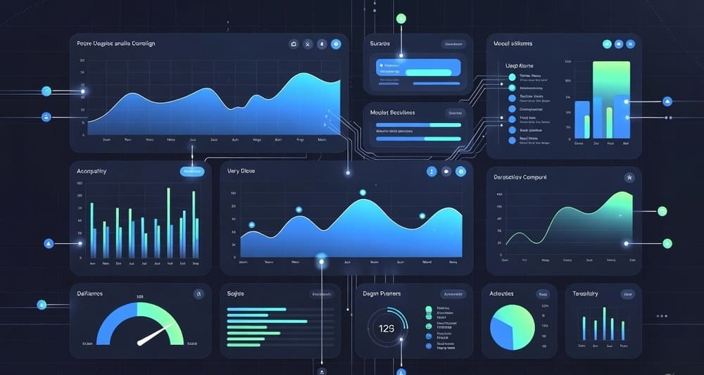
You build dashboards using panels. Each panel visualizes data in different ways. Time-series graphs, bar charts, heatmaps, tables, gauges. Dashboards update in real time as new data arrives.
Grafana Labs, the company behind Grafana, offers both the open-source version and Grafana Cloud, a managed service.
Core Capabilities
Multi-Source Data Querying
Grafana’s strength is connecting to multiple data sources in one dashboard. You can show Prometheus metrics alongside CloudWatch logs and PostgreSQL data.
Each data source has its own query language. Grafana provides a query builder interface, but power users write queries directly. PromQL for Prometheus, SQL for databases, LogQL for Loki.
The data source plugin architecture means new integrations appear regularly. If a data source matters to your industry, someone probably built a Grafana plugin for it.
Dashboard Building
Dashboards are collections of panels arranged on a grid. You drag panels to resize and position them. Variables make dashboards dynamic. Filter by environment, region, or service without creating separate dashboards.
Template variables are powerful. You define a variable that queries your data source. Users select from a dropdown. Every panel using that variable updates automatically.
Annotations mark events on time-series graphs. Deploy a new version? Add an annotation. Now you see if metrics changed after deployment.
Alerting System
Grafana handles alerting natively. You define alert rules based on query results. When conditions are met, Grafana sends notifications.
The new unified alerting system (introduced in Grafana 8) brought major improvements. Multi-dimensional alerting, better notification routing, and integration with external alert managers.
You can send alerts to Slack, PagerDuty, email, webhooks, or dozens of other channels. Alert rules support complex logic, multiple conditions, and threshold evaluation over time windows.
Real-Time Monitoring
Dashboards refresh automatically. You set the interval. Every 5 seconds, every minute, whatever makes sense for your data.
For operational dashboards shown on screens in NOCs or war rooms, this is critical. Teams need to see current system state without manual refreshing.
The live data feature streams updates to panels without full page reloads. This creates smooth, real-time visualizations.
Exploration and Ad-Hoc Analysis
Explore mode lets you query data sources without building full dashboards. You’re investigating an issue and need quick answers. Open Explore, write queries, see results.
This is valuable during incidents. You don’t have time to build a dashboard. You need to query logs, metrics, and traces immediately.
Explore supports multiple queries side by side. Compare metrics from different services or time ranges.
Data Source Integration
Time-Series Databases
Prometheus is the most common pairing with Grafana. Prometheus scrapes metrics, Grafana visualizes them. They’re designed to work together.
InfluxDB is another popular choice. It stores time-series data and Grafana queries it using InfluxQL or Flux.
Graphite is older but still used. Many legacy monitoring systems run Graphite with Grafana frontends.
TimescaleDB bridges SQL and time-series. You get PostgreSQL’s query power with time-series optimizations.
Logging Systems
Loki is Grafana Labs’ logging solution. It’s like Prometheus but for logs. LogQL queries feel familiar if you know PromQL.
Elasticsearch powers many logging stacks. Grafana connects to Elasticsearch and visualizes log data alongside metrics.
Splunk integration exists for enterprises already invested in Splunk.
Cloud Platform Metrics
CloudWatch integration lets you visualize AWS metrics without leaving Grafana.
Azure Monitor does the same for Microsoft Azure.
Google Cloud Monitoring (formerly Stackdriver) connects GCP metrics to Grafana.
This means you can build unified dashboards across cloud providers. Multi-cloud monitoring from one interface.
Databases
PostgreSQL, MySQL, Microsoft SQL Server all work as Grafana data sources. You can visualize business metrics stored in relational databases.
This opens Grafana beyond infrastructure monitoring. Sales dashboards, user analytics, operational reports. If the data is in a database, Grafana can show it.
BigQuery and Snowflake support means you can visualize data warehouse queries. This brings Grafana into data engineering and analytics workflows.
Tracing Systems
Jaeger and Tempo provide distributed tracing. Grafana visualizes trace data to understand request flows through microservices.
Zipkin integration exists for teams using that tracing system.
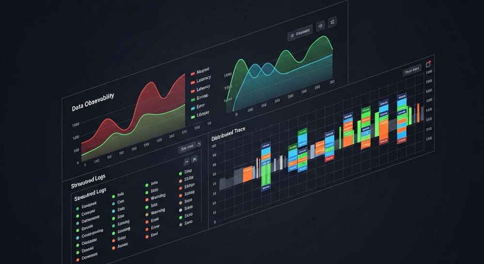
Combining traces with metrics and logs in one dashboard gives complete observability.
Application Performance Monitoring
New Relic, Datadog, and Dynatrace data can flow into Grafana. This is less common since these platforms have their own visualization, but the option exists.
Grafana vs. Other Visualization Tools
Grafana vs. Tableau
Tableau is a business intelligence tool. It’s designed for analysts exploring data and building reports.
Grafana is an operational monitoring tool. It’s designed for real-time system observation.
Tableau excels at complex data manipulation, statistical analysis, and polished business reports. It handles a wider variety of chart types and has more sophisticated data modeling.
Grafana excels at time-series visualization, real-time updates, and integration with monitoring systems. It’s built for DevOps and engineering teams.
Use Tableau when you need business intelligence and data discovery. Use Grafana when you need real-time operational dashboards.
Grafana vs. Kibana
Kibana is the visualization layer of the Elastic Stack. It’s tightly coupled with Elasticsearch.
Grafana supports Elasticsearch but also dozens of other data sources. Kibana only works with Elastic.
Kibana has better log exploration features. The Discover interface is powerful for ad-hoc log analysis.
Grafana has better time-series visualization and multi-source dashboards. Alerting is more flexible.
Many teams use both. Kibana for deep log analysis, Grafana for operational dashboards that combine logs with other data.
Grafana vs. Datadog
Datadog is a commercial monitoring platform. It’s an all-in-one solution with its own agents, storage, and visualization.
Grafana is open source and visualization-focused. You bring your own data storage.
Datadog is easier to start with. Install agents, data flows to Datadog, dashboards appear. Everything is integrated.
Grafana requires more setup but offers more flexibility. You control where data is stored and processed.
Cost models differ significantly. Datadog charges per host and data volume. Grafana is free (open source) or costs based on active users (Grafana Cloud).
Use Datadog when you want an integrated, managed solution. Use Grafana when you want flexibility and control.
Grafana vs. Power BI
Power BI is Microsoft’s business intelligence platform. Like Tableau, it’s for business analytics.
Power BI integrates deeply with Microsoft ecosystem. Excel, Azure, Office 365. If you’re a Microsoft shop, Power BI fits naturally.
Grafana integrates with DevOps and observability tools. If you’re running Kubernetes with Prometheus, Grafana fits naturally.
The use cases barely overlap. Power BI is for business metrics and reporting. Grafana is for technical metrics and monitoring.
Common Use Cases
Infrastructure Monitoring
This is where Grafana started. Monitor servers, containers, networks. CPU usage, memory consumption, disk I/O, network traffic.
Prometheus scrapes metrics from node exporters. Grafana visualizes them. You see which servers are overloaded, which containers are crashing, where network bottlenecks exist.
Teams run Grafana dashboards on large screens in operations centers. When something breaks, the dashboard shows it immediately.
Application Performance Monitoring
Track application metrics. Request rates, error rates, latency percentiles. The RED method (Rate, Errors, Duration) or USE method (Utilization, Saturation, Errors).
You instrument your application to expose metrics. Grafana shows how the application performs under load.
This helps identify performance bottlenecks, track down errors, and understand user experience.
Kubernetes Monitoring
Kubernetes generates massive amounts of metrics. Cluster state, pod health, resource usage, API server performance.
Grafana dashboards for Kubernetes are essential. You need to see what’s happening across hundreds of pods and dozens of nodes.
Pre-built dashboards exist for common Kubernetes monitoring scenarios. Import them, connect to your Prometheus, and you’re monitoring your cluster.
Database Monitoring
Database performance matters. Slow queries kill applications.
Grafana connects to database metrics exporters. PostgreSQL exporter, MySQL exporter, MongoDB exporter. You visualize query performance, connection pools, replication lag, cache hit rates.
Some teams query databases directly from Grafana to show business metrics alongside technical metrics. Orders per minute next to database connection count.
Business Metrics
Not everything in Grafana needs to be infrastructure. You can show business KPIs.
Query your production database for user signups, revenue, active sessions. Display them on Grafana dashboards.
This puts business context next to technical metrics. You see a traffic spike and immediately know if it’s legitimate user growth or a DDoS attack.
IoT and Sensor Data
IoT devices generate time-series data. Temperature sensors, pressure gauges, GPS trackers.
Store this data in InfluxDB or TimescaleDB. Visualize it with Grafana. You get real-time views of sensor readings across your fleet.
Manufacturing, agriculture, logistics, and smart cities use Grafana for IoT monitoring.
Data Engineering Pipelines
Data engineers use Grafana to monitor ETL pipelines. Track job success rates, processing times, data volumes.
Airflow exposes metrics. DBT can expose metrics. Your data warehouse can expose metrics. Grafana shows them all together.
You see when pipelines slow down, when data volumes spike unexpectedly, when jobs start failing.
Key Features and Functionality
Panel Types
Grafana offers many visualization types. Pick the right one for your data.
Time-series graphs are the most common. They show how metrics change over time. Multiple series on one graph, different Y-axes, area fills, stacking.
Bar gauges show current values against thresholds. Green when good, yellow when warning, red when critical.
Stat panels display single values. Current error rate, total requests, average latency. Big numbers that answer “what’s the current state?”
Tables show raw data in rows and columns. Good for log entries, recent events, or detailed breakdowns.
Heatmaps visualize distribution. Latency percentiles over time, request distribution across servers.
Pie charts and bar charts work for categorical breakdowns. Traffic by region, errors by type.
Geomap panels plot data on maps. Server locations, user distribution, sensor placement.
Node graphs show relationships. Service dependencies, network topology.
Transformations
Transformations modify query results before visualization. Join data from multiple queries, filter rows, calculate new fields, rename columns.
This is powerful. You query raw data and transform it into exactly what you need for visualization.
Common transformations include grouping, aggregating, sorting, filtering, and mathematical operations.
Variables and Templating
Variables make dashboards dynamic. Instead of hardcoding server names or regions, use variables.
A variable might query your data source for all available servers. Users select which server to view. All panels update automatically.
Variables can be chained. Select a region, then see only servers in that region as options for the next variable.
This turns one dashboard into many. A single dashboard template works across all environments, regions, and services.
Provisioning and Configuration as Code
Grafana supports provisioning through configuration files. Define data sources, dashboards, and alert rules in JSON or YAML.
Check these files into version control. Deploy Grafana instances with dashboards pre-configured.
This is critical for infrastructure as code practices. You don’t manually configure dashboards in production. You define them in code, test them, and deploy them.
Authentication and Access Control
Grafana integrates with enterprise authentication systems. LDAP, OAuth, SAML, Azure AD.
Role-based access control lets you restrict who can view or edit dashboards. Some users can only view. Others can edit. Admins can modify data sources.
Organizations and teams help manage access in larger deployments. Create separate spaces for different teams or departments.
Plugins and Extensions
Grafana has a plugin ecosystem. Data source plugins connect to new systems. Panel plugins add new visualization types. App plugins add complete new features.
Popular plugins include Worldmap Panel, Pie Chart, Polystat. Many are built by the community.
You can build custom plugins for internal systems or proprietary data sources.
Grafana Loki for Logs
Loki deserves special attention. It’s Grafana Labs’ answer to Elasticsearch for logs.
The design philosophy differs from traditional logging systems. Loki doesn’t index log content. It only indexes labels (metadata). This makes it cheaper and faster for certain use cases.
You query logs using LogQL, which feels like PromQL. If you know Prometheus, Loki is familiar.
The combination of Grafana, Prometheus, and Loki creates a complete observability stack. Metrics, logs, and dashboards from one vendor with consistent interfaces.
Loki works well for container logs, application logs, and system logs. It scales to billions of log entries per day.
Grafana Tempo for Traces
Tempo is Grafana Labs’ distributed tracing backend. Like Loki, it’s designed to be cost-effective and simple.
Tempo stores traces but only indexes them by trace ID. You search for traces by querying metrics or logs first, then jumping to the relevant trace.
This approach reduces storage costs. Full-text trace search is expensive. Most of the time, you find interesting traces through metrics or logs anyway.
Tempo integrates seamlessly with Grafana dashboards. Click a trace ID in logs, see the full trace. Correlate slow requests (metrics) with trace data.
Grafana Cloud vs. Self-Hosted
You have two options. Run Grafana yourself or use Grafana Cloud.
Self-Hosted Grafana
You install Grafana on your infrastructure. Docker containers, Kubernetes, virtual machines, bare metal.
Advantages:
- Complete control over data and infrastructure
- No data egress costs
- Customization freedom
- Works in air-gapped environments
Disadvantages:
- You manage upgrades and maintenance
- You handle scaling and high availability
- You need to secure it yourself
- Operational overhead
Self-hosted works well when you have strict data requirements, already run other infrastructure, or want to avoid cloud costs.
Grafana Cloud
Grafana Labs runs Grafana for you. They handle infrastructure, scaling, updates, security.
Advantages:
- No operational overhead
- Automatic updates to latest features
- Built-in scalability
- Managed Prometheus, Loki, and Tempo included
Disadvantages:
- Ongoing subscription costs
- Data lives in Grafana’s cloud
- Less customization flexibility
- Potential data egress costs
Grafana Cloud makes sense when you want to focus on dashboards, not infrastructure. The free tier is generous for small deployments.
Best Practices
Dashboard Design
Keep dashboards focused. One dashboard per logical system or service. Don’t create mega-dashboards that show everything.
Use consistent naming. Establish naming conventions for dashboards, panels, and variables. Future you will appreciate it.
Add descriptions. Panel descriptions explain what you’re seeing. When someone wakes up at 3 AM to check a dashboard, those descriptions help.
Set sensible refresh rates. Not everything needs 5-second updates. Longer intervals reduce load on data sources.
Use variables for reusability. Build dashboard templates that work across environments.
Organize with folders. Group related dashboards. Infrastructure in one folder, application metrics in another.
Query Optimization
Query only what you need. Select specific fields instead of returning everything.
Use appropriate time ranges. Querying six months of data when you need one hour wastes resources.
Leverage caching. Grafana caches query results. Configure cache TTLs appropriately.
Pre-aggregate when possible. For heavily queried metrics, pre-compute aggregations in your data source.
Alert Configuration
Alert on symptoms, not causes. Alert when users are affected, not when individual components fail.
Set appropriate thresholds. Too sensitive creates alert fatigue. Too lenient misses real problems.
Use notification channels wisely. Critical alerts go to PagerDuty. Warnings go to Slack. Choose channels that match severity.
Include context in alerts. Alert messages should contain enough information to start troubleshooting.
Test alerts before deploying. Verify alerts trigger correctly and notifications reach the right people.
Performance and Scaling
Limit the number of queries per dashboard. Each query hits your data source. Too many slow down dashboards.
Use recording rules in Prometheus. Pre-compute expensive queries. Grafana queries the pre-computed results.
Consider query federation. For very large deployments, federate queries across multiple data sources.
Monitor Grafana itself. Grafana exposes metrics about its own performance. Dashboard load times, query errors, resource usage.
Common Challenges and Solutions
Dashboard Sprawl
Teams create too many dashboards. Finding the right one becomes difficult.
Solution: Establish governance. Designate dashboard owners. Archive unused dashboards. Create clear naming conventions and folder structures.
Slow Queries
Dashboards load slowly because queries are inefficient.
Solution: Optimize queries at the data source level. Use pre-aggregation. Limit time ranges. Add indexes to databases. Use Grafana’s query inspector to identify slow queries.
Alert Fatigue
Too many alerts firing. Teams ignore them.
Solution: Review and tune thresholds. Remove low-value alerts. Consolidate related alerts. Use alert grouping and routing to reduce noise.
Inconsistent Dashboards
Different teams create dashboards with different styles and approaches.
Solution: Create dashboard templates. Establish standards for panel types, colors, and naming. Share best practices across teams.
Version Control
Dashboards change over time. You need to track changes and potentially roll back.
Solution: Use provisioning with configuration files in Git. Export important dashboards to JSON and commit them. Use Grafana Cloud’s built-in version history if available.
Getting Started with Grafana
Installation is straightforward. Docker image, package managers, or Kubernetes Helm charts. Grafana starts with a web interface on port 3000 by default.
First steps involve adding data sources. Connect to Prometheus, InfluxDB, or your database of choice. Test the connection to verify it works.
Import existing dashboards from Grafana’s dashboard library. Thousands of pre-built dashboards exist. Find one for your use case, import it, and customize.
Build your first dashboard by adding panels. Start with a time-series graph showing a simple metric. Add more panels as you learn.
Set up alerts once you have dashboards. Define alert rules based on your metrics. Configure notification channels.
Iterate and improve. Dashboards evolve. Add panels as you discover new metrics. Remove panels that don’t provide value.
The Ecosystem Around Grafana
Grafana sits at the center of an observability ecosystem.
Prometheus is the most common metric source. They’re designed to work together.
Loki handles logs. Same query language patterns as Prometheus.
Tempo provides tracing. Completes the observability triangle.
OpenTelemetry sends data to all three. Industry standard for instrumentation.
Alertmanager handles alert routing and aggregation. Works with Grafana alerts.
Cortex and Mimir provide scalable, multi-tenant Prometheus. Grafana visualizes their data.
This ecosystem creates a complete observability platform. You can build it piece by piece or use Grafana Cloud’s integrated offering.
Future Trends and Developments
Grafana keeps evolving. Several trends are shaping its future.
Unified observability is the goal. Metrics, logs, and traces in one interface with seamless correlation.
Machine learning integration is growing. Anomaly detection, forecasting, and automated insights.
Collaborative features are expanding. Comments on panels, team annotations, shared exploration sessions.
Mobile support is improving. View dashboards on phones and tablets.
Performance optimizations continue. Faster queries, better caching, more efficient rendering.
Plugin ecosystem keeps growing. More data sources, more panel types, more integrations.
Grafana OnCall adds incident management. From alerting to on-call rotation to incident response.
Key Takeaways
Grafana transformed from a metrics visualization tool into a comprehensive observability platform. It’s the standard choice for operational dashboards across industries.
The open-source model combined with commercial support from Grafana Labs creates a sustainable ecosystem. You can start free and scale to enterprise needs.
Flexibility is Grafana’s strength. Connect to any data source, build any visualization, deploy anywhere.
The learning curve is reasonable. Basic dashboards are easy. Advanced features take time to master.
Grafana works best as part of an observability stack. Pair it with Prometheus for metrics, Loki for logs, and Tempo for traces.
Whether you run it yourself or use Grafana Cloud, Grafana solves the problem of making sense of operational data.
Tags: Grafana, data visualization, observability, monitoring dashboards, Prometheus, time-series visualization, Grafana Loki, Grafana Tempo, infrastructure monitoring, application monitoring, DevOps tools, real-time dashboards, metrics visualization, logging, distributed tracing, Kubernetes monitoring, cloud monitoring, open-source monitoring, Grafana Cloud

