Power BI in 2026: A Practical Guide for Data Teams
Introduction
Power BI dominates enterprise business intelligence. Microsoft reports over 600,000 organizations use it. If you work with data, you’ll encounter it eventually.
The tool has come a long way since its 2015 launch. What started as an Excel add-in became a full analytics platform. It connects to hundreds of data sources, handles billions of rows, and integrates deeply with the Microsoft ecosystem.
This guide explains what Power BI does well, where it falls short, and how to use it effectively. You’ll learn practical techniques for building reports, optimizing performance, and deploying at scale.
What Power BI Actually Is
Power BI is Microsoft’s business intelligence platform. It has three main components.
Power BI Desktop is where you build reports. It’s a free Windows application. You connect to data, build models, create visualizations, and publish to the cloud.
Power BI Service is the cloud platform. Reports live here. Users view dashboards, share content, and collaborate. This is where governance and security happen.
Power BI Mobile lets users access reports on phones and tablets. It’s more than just a viewer. You can annotate, share, and get alerts.
The platform also includes Power BI Report Server for on-premises deployment, Power BI Embedded for white-label scenarios, and various APIs for programmatic access.
Core Capabilities
Data Connectivity
Power BI connects to almost anything. The list includes databases (SQL Server, PostgreSQL, MySQL, Oracle), cloud data warehouses (Snowflake, Databricks, BigQuery), SaaS applications (Salesforce, Google Analytics, Azure DevOps), files (Excel, CSV, JSON, Parquet), and APIs.
Most connections work through built-in connectors. Some require gateways for on-premises data. The gateway is a bridge between your local network and the Power BI cloud service.
You can import data into Power BI or query it directly. Import mode loads data into Power BI’s in-memory engine. DirectQuery leaves data at the source and sends queries in real time. Composite models let you mix both approaches.
Data Transformation with Power Query
Power Query is the ETL layer inside Power BI. It handles data cleaning, shaping, and preparation. The interface is point-and-click, but it generates M code behind the scenes.
Common transformations include filtering rows, removing duplicates, pivoting and unpivoting, merging tables, appending data, splitting columns, and changing data types. You can also write custom M code for complex scenarios.
Power Query uses query folding when possible. This pushes transformation logic back to the source database. Your SQL server does the work instead of Power BI. This is faster and more efficient, but not all transformations fold.
Data Modeling with DAX
DAX (Data Analysis Expressions) is Power BI’s formula language. You use it to create calculated columns, measures, and calculated tables.
Measures are where DAX shines. They’re dynamic calculations that respond to filter context. A sales measure changes based on which product, region, or time period the user selects.
Common patterns include time intelligence (year-over-year growth, moving averages), context manipulation (calculate totals ignoring certain filters), and complex aggregations.
DAX has a learning curve. The syntax looks like Excel formulas, but the evaluation model is different. Understanding filter context and row context is essential.
Visualization Options
Power BI includes dozens of built-in visuals. Bar charts, line charts, scatter plots, maps, tables, matrices, cards, gauges, and more. Most business needs are covered.
Custom visuals extend the library. The marketplace has hundreds created by Microsoft, partners, and the community. Some are excellent. Others are poorly maintained or have performance issues.
The visualization layer is interactive by default. Click a bar chart and other visuals filter automatically. This cross-filtering makes exploration intuitive for end users.
Report design matters more than people think. Good reports guide users to insights. Bad reports confuse them. Layout, color choices, and visual hierarchy all impact usability.
Performance Optimization Strategies
Performance problems are common with Power BI. Users complain about slow reports. Here’s how to fix them.
Import Mode Performance
Import mode loads data into Power BI’s VertiPaq engine. This columnar database is fast when configured correctly.
Reduce data volume. Only import what you need. Filter out historical data users don’t access. Remove unnecessary columns. Aggregate data where possible.
Optimize data types. Smaller data types mean less memory usage. Use integer instead of decimal when you don’t need precision. Avoid text columns when numeric or date types work.
Remove unnecessary columns early. Delete columns in Power Query before loading. Columns you remove in the model still consume memory during refresh.
Avoid high cardinality columns. Columns with millions of unique values compress poorly. Consider binning or aggregating them.
Use proper relationships. Star schema models perform better than flat tables. Create dimension tables and fact tables with proper relationships.
Minimize calculated columns. They consume memory and slow refresh. Use measures instead when possible.
Partition large tables. Power BI Premium supports incremental refresh. Only reload changed data instead of the entire table.
DirectQuery Performance
DirectQuery sends queries to your source database. Performance depends on that database.
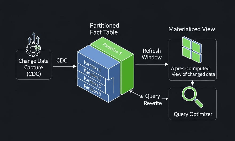
Optimize source queries. Add indexes on columns used in filters and joins. Make sure statistics are current. Consider materialized views for complex aggregations.
Reduce visual count. Each visual sends queries. Pages with 20 visuals make 20 database calls. Consolidate where possible.
Limit filter interactions. Cross-filtering between visuals creates additional queries. Disable interactions that users don’t need.
Use aggregations. Power BI can query pre-aggregated tables for summary views and detailed tables for drill-through. This hybrid approach improves speed.
Monitor query patterns. Enable query diagnostics in Power BI Desktop. See what SQL Power BI generates. Optimize those queries in your database.
DAX Performance
Bad DAX formulas slow everything down. Good DAX makes a huge difference.
Use variables. Variables cache intermediate results. This avoids recalculating the same expression multiple times.
Avoid row-by-row iteration. Functions like FILTER that iterate through every row are slow. Use built-in aggregations when possible.
Be careful with ALL and ALLSELECTED. They remove filters and can cause large result sets. Use them precisely.
Minimize context transitions. Calculated columns force row context to filter context conversion. This is expensive on large tables.
Test with realistic data volumes. A formula that works on 1,000 rows might fail on 1 million. Test at scale before deploying.
Use SUMMARIZE and SUMMARIZECOLUMNS carefully. These functions have subtle performance characteristics. SUMMARIZECOLUMNS is usually faster.
Development Best Practices
Building maintainable Power BI solutions requires discipline. These practices help.
Model Design
Follow star schema principles. Separate facts from dimensions. Facts contain measures and foreign keys. Dimensions contain descriptive attributes.
Use meaningful table and column names. “DimProduct” is better than “Table1”. “Total Sales” is better than “Measure1”.
Hide technical columns. Users shouldn’t see foreign keys and technical fields. Hide them in the model.
Organize measures in folders. Display folders group related measures. This makes large models navigable.
Document complex logic. Add descriptions to measures and calculated columns. Future you will appreciate it.
Maintain naming conventions. Prefix measures with an underscore or keep them in a separate table. Make it obvious what’s a measure vs. a column.
Development Workflow
Use version control. Power BI files are binary, but you can extract the model definition as JSON. Tools like Tabular Editor make this easier.
Separate data and presentation. Build a robust data model first. Create reports second. This makes testing and maintenance easier.
Create a development workspace. Don’t develop directly in production. Use separate workspaces for dev, test, and prod.
Test with production data volumes. Performance issues often only appear at scale. Test with realistic data sizes.
Build reusable components. Create template reports with standard layouts, color schemes, and branding. Use them as starting points.
Document data sources and refresh schedules. Make it clear where data comes from and how often it updates.
Deployment Process
Use deployment pipelines. Power BI Premium and PPU include deployment pipelines. Move content from dev to test to prod with rules and automation.
Automate what you can. Use the Power BI REST API or PowerShell to automate deployments, refreshes, and administration.
Plan for disaster recovery. Back up important reports and datasets. Have a process to restore them if needed.
Monitor refresh failures. Set up alerts for failed refreshes. Fix issues before users notice.
Manage gateway capacity. Gateways can bottleneck. Monitor performance and add capacity when needed.
Security and Governance
Enterprise deployments need proper security. Power BI has several layers.
Row-Level Security
RLS restricts data access at the row level. Users only see data they’re allowed to see.
You define roles with DAX filter expressions. A role might filter the Sales table to only show rows where Region equals the user’s region.
Users get assigned to roles. You can assign individuals or Azure AD groups. Groups are easier to manage at scale.
Dynamic RLS uses DAX functions like USERNAME() or USERPRINCIPALNAME(). The filter adapts based on who’s viewing the report.
Test RLS thoroughly. It’s easy to create logical errors that either expose too much data or hide data users need.
Workspace Security
Workspaces are containers for related content. They have four roles with different permissions.
Admin can do everything including managing members and deleting the workspace.
Member can publish content, manage content, and manage permissions on individual items.
Contributor can publish and manage their own content but can’t manage workspace settings.
Viewer can only view content, not edit or publish.
Map these roles to your organizational structure. Don’t give everyone admin access.
App Security
Apps are curated collections of reports and dashboards. They’re how most users consume content.
Apps separate content creation from consumption. Report developers work in workspaces. End users access apps.
You control app permissions separately from workspace permissions. This gives you fine-grained control over who sees what.
Sensitivity Labels
Microsoft Information Protection labels work with Power BI. You can classify datasets and reports as public, internal, confidential, or highly confidential.
Labels follow the data when exported. They can prevent download, printing, or sharing based on classification.
This requires Azure Information Protection and configuration in the Microsoft 365 compliance center.
Integration with the Microsoft Ecosystem
Power BI integrates deeply with other Microsoft products. This is both a strength and a lock-in factor.
Azure Integration
Power BI connects natively to Azure data services. Azure SQL Database, Synapse Analytics, Databricks, Data Lake Storage, and others all have optimized connectors.
You can embed Power BI reports in Azure applications. The embedded analytics scenario uses Power BI Embedded capacity.
Azure Active Directory handles authentication. Users sign in with their corporate credentials. Single sign-on works across services.
Microsoft 365 Integration
Power BI appears in Teams, SharePoint, and Excel. Users can access reports without leaving these applications.
The Excel integration goes both ways. You can publish Excel tables to Power BI. You can also analyze Power BI datasets in Excel using pivot tables.
Outlook subscriptions deliver report snapshots via email on a schedule.
Power Platform Integration
Power Automate can trigger actions based on Power BI data alerts. When a metric crosses a threshold, send notifications, create tickets, or start workflows.
Power Apps can embed Power BI reports. Build custom applications with live data visualizations.
Dataverse (Common Data Service) connects to Power BI. This creates end-to-end scenarios from apps to workflows to analytics.
Licensing and Costs
Power BI licensing is confusing. Here’s what you need to know.
Power BI Free lets you use Power BI Desktop and publish to personal workspaces. You can’t share content with others.
Power BI Pro costs $10 per user per month. It enables collaboration, sharing, and most features. Both content creators and consumers need Pro licenses.
Power BI Premium Per User (PPU) costs $20 per user per month. It adds features like deployment pipelines, paginated reports, and larger dataset sizes. Again, both creators and consumers need PPU.
Power BI Premium costs thousands per month. It’s capacity-based instead of per-user. You buy compute and storage capacity. Any user can consume content without a Pro license. Premium includes features like incremental refresh, large models, and XMLA endpoints.
Power BI Embedded is for ISVs embedding Power BI in applications. Pricing is based on Azure resources consumed.
For small teams, Pro licenses work fine. As you scale, Premium becomes cost-effective. The break-even point is around 200-300 users, but it depends on your specific needs.
Common Pitfalls and How to Avoid Them
People make predictable mistakes with Power BI. Here are the big ones.
Importing too much data. New users import entire databases. This causes performance problems and refresh failures. Be selective. Only import what you need.
Creating overly complex models. Some reports have 50+ tables with dozens of relationships. Simpler is better. Consolidate where possible.
Ignoring incremental refresh. Large datasets should use incremental refresh. Reloading millions of rows daily wastes time and resources.
Poor report design. Reports with 30 visuals on one page overwhelm users. Focus on key metrics. Use drill-through for details.
Not using parameters. Hardcoded connection strings and file paths cause problems when moving between environments. Use parameters.
Skipping data modeling. Some people skip the model and connect directly to source tables. This works for simple cases but breaks down quickly.
Overlooking gateway capacity. Gateways have limits. Monitor usage and scale appropriately.
Weak security design. Don’t rely on hiding visuals for security. Use proper RLS and workspace permissions.
Alternatives and When to Consider Them
Power BI isn’t always the right choice. Here are scenarios where alternatives make sense.
Tableau has better visualization capabilities and more flexibility in chart design. If visual excellence matters most, consider Tableau.
Looker is better for teams that prefer code over GUIs. Everything is defined in LookML. Version control and testing are more natural.
Qlik has a different associative model that some users find more intuitive. It handles certain types of data exploration better.
Sigma gives non-technical users spreadsheet-like access to cloud data warehouses. It’s simpler for ad-hoc analysis.
Metabase and Superset are open-source options. They’re free but require self-hosting and maintenance.
Custom dashboards built with Plotly, D3, or similar libraries give complete control. This makes sense for embedded scenarios or unique requirements.
Power BI’s strength is the Microsoft ecosystem integration and cost-effectiveness at scale. If those matter, it’s hard to beat.
The Future of Power BI
Microsoft invests heavily in Power BI. Several trends are shaping where it’s going.
More AI features are coming. Natural language queries are improving. Automated insight detection is getting smarter. Anomaly detection is becoming standard.
Better developer experiences are a focus. Git integration is in preview. Command-line tools are improving. The separation between model and presentation is getting cleaner.
Tighter Azure Synapse integration makes sense given Microsoft’s data platform strategy. Expect Power BI to become even more central to the Azure analytics story.
Real-time analytics capabilities are expanding. DirectQuery is getting faster. Composite models are more flexible. Streaming datasets handle more scenarios.
Python and R integration continues to improve. Data scientists can use familiar tools within Power BI.
Embedded analytics is growing. More applications will include Power BI visualizations without users knowing they’re using Power BI.
Key Takeaways
Power BI is the dominant enterprise BI tool for good reason. It balances capability, usability, and cost effectively.
The tool handles most business intelligence needs. Data connectivity is comprehensive. The modeling engine is powerful. Visualizations cover common requirements.
Performance requires attention. Import mode needs proper data modeling. DirectQuery needs database optimization. DAX formulas need careful design.
Security and governance are essential at scale. Use RLS, workspace permissions, and sensitivity labels appropriately.
The Microsoft ecosystem integration is both a strength and a consideration. If you’re invested in Microsoft technologies, Power BI is a natural fit.
Alternatives exist for specific needs. Evaluate based on your requirements, not just features lists.
Success with Power BI requires both technical skills and design thinking. Learn DAX and data modeling. Also learn how to present data effectively.
Tags: Power BI, business intelligence, data visualization, DAX, Power Query, Microsoft BI, enterprise analytics, data modeling, BI tools, self-service analytics, Power BI performance, Power BI security, DirectQuery, import mode, Power BI best practices, Azure integration, Microsoft 365, BI development


